Community Integration Manager
A platform for clinics with provider-sponsored health plans to streamline administration and deliver integrated patient care.
Healthcare
Stakeholder interviews
User research
Prototyping
UX/UI
Usability testing
Personas
User journeys
Branding
Overview
Overview
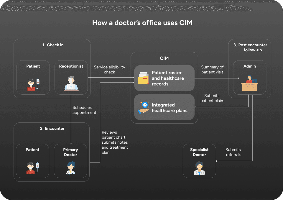
I was tasked with redesigning a specific product offering named Community Integration Manager (CIM) for an Oregon-based healthcare company called Performance Health Technology (PH Tech). Their goal was to improve the overall efficiency of doctor's offices that provided both healthcare and community insurance plans for comprehensive patient care.

Team
Team
My teammates included a project manager, creative director, and ten client developers. I was responsible for initial user research, UX/UI design, and a minor branding refresh.


Research
Research
I spent a few days onsite with PH Tech in Salem Oregon at one of their client doctor's office interviewing both their product team and some of the back office admins. Due to HIPPA regulations I wasn't able to observe patient visits, but I did get a comprehensive walkthrough of their existing interface. Below is a sample screenshot taken from a test account.


Personas and user journeys
Mapping the entire experience to find the biggest opportunities.
After my visit with PH Tech, I had reams of data and needed to synthesize it down into some key insights that our team could use as a focus for our redesign efforts.


Key quotes and observed workflow patterns were organized into themes and key takeaways. These insights were then diagramed into user journey artifacts that the team could reference for the duration of the project when coming up with ideas on how to improve the existing experience.


Design goals
Now that the team had a complete picture of how the system currently works, we adopted two high level goals for the redesign.
Reduce the number of required drill-in actions.
Provide better tools for visualizing work priority.
Improved eligibility lookup
Reduce the need for redundant searches and page drill-ins.
Our front desk receptionist, Amber, is tasked with checking the eligibility status of tomorrow's appointments while managing the front office by checking people in for appointments and answering questions for patients waiting in the lobby.


In this design we placed a multi lookup search box in the primary top left of the page and defaulted eligibility start date to the following day. Amber can copy / paste her member IDs directly into the search field, which will separate values automatically with commas and then filter to a specific insurance provider. If Amber discovers a patient's insurance is "termed" meaning it is out of date or doesn't cover the type of appointment scheduled, she'll give the patient a call. We make this easier for her by highlighting member IDs she provided in her search that belong to termed insurance coverage.
The patient's phone number is listed directly in the results so Amber doesn't have to go looking for it. Once she has finished following up, Amber can close the patient card to help her keep track of patients that she's already cleared for tomorrow's appointments.
Authorizations dashboard
Surface recent authorization requests in one place.
Authorization and referral coordinators have similar pain points as our front desk receptionist and also need to know similar information about a patient when checking the status of a referral. However, their workflow takes place after the patient has visited the clinic. Our onsite observations showed that these admins have a lot of additional work and will often check back on the status of referrals multiple times a day when they catch a break.


This prioritized list helps our authorizations and referrals specialist, Joyce, by providing a single page with all authorizations submitted and/or processed in the last 48 hours. Prioritization defaults to urgent authorizations which would be time-sensitive procedures and a smart default of 24 hours is applied to urgent authorizations so Joyce knows when something urgent is taking too long and she needs to call the insurance provider.
Here the value of our card design really shines. Authorizations are part of what PH Tech calls "episodes of care" where we can see a history or recent authorizations for a patient. In this mock, we see that Jessica McMasters is a patient that has been coming to the clinic once a year for a check up with the same chronic condition. Her physician has recommended a new course of treatment that was unexpectedly denied by Jessica's insurance. It's helpful for Joyce to know more about this patient's history without having to call up Dr. Shurt. Joyce has everything she needs to call the insurance provider directly and figure out what the blocker is.
Claims aging dashboard
Help prioritize work with default follow up windows and a priority status.
Sofia, our billing manager spends a lot of time processing claims and collecting payments from patients. Prior to our design, Sofia would need to keep a list of all recent claims in separate files and check back every day to determine what claims have an outstanding balance before following up with a patient. This resulted in a lot of post-it notes stuck to screen monitors.


Our standardized approach to displaying contextualized patient information also helps Sofia do her work faster. Claims are organized on a single page with any unpaid balances floating to the top. A default warning of one month is applied to outstanding balances so anything that hasn't been paid off in a timely manor is shuffled to the front of the queue. The patient's phone number once again comes in handy and Sofia can see that the payment is overdue, how much is left to pay, and the number to call.
If the patient has any questions or concerns about the remaining balance, a mini ledger gives Sofia the information she needs to help explain remaining remaining charges.
Impact
Impact
Working on a healthcare project was a deeply rewarding experience. Our team was able to provide some real value to PH Tech's product that improved their marketability and most importantly, the quality of patient care at their clients' clinics.

Average page clicks
Reduced to 6 from 2

Time saved
1-2 hours per day

Average page clicks
Reduced to 6 from 2

Time saved
1-2 hours per day

Average page clicks
Reduced to 6 from 2

Time saved
1-2 hours per day
Next case study
Up next
© 2025 Jacob Farny